So guys, I've finally discovered “the secret to success”—and no, it does not require Himalayan bath salts*.
*Also does not require Ben Gay, thank god.
The real secret to success is in learning how to be both a lawyer and a serial killer, and I say that with all sincerity.
[Insert image of me knifing my book here.]
Who wants a serial killer in their inbox? I know! But alas, you've got one: it's the only way to create anything that matters.
GO AHEAD, ASK ME HOW I KNOW.
On May 15th, 2019 at 5:58pm, I received the very first mock-up of our book cover. This, for the record, is a terrifying experience. More terrifying than opening your report card at age eleven, any email from HealthCare.gov, or a package from the IRS labeled “official business.”
I was enjoying a glass of Carmenere at a wine bar called Cooperage, as you do, and suddenly I realized that this was a very serious matter: if for any reason, any reason at all, the cover itself wasn't MAGNIFICENT, it would mean that all of my work over the past three years (ten years if we're counting since the beginning of this journey) could be…ignored. Looked over. Never seen.
Because man, let me tell you: the blind are the only ones not judging a book by its cover. Everybody else? Judging! JUDGINGGGGGG. JUUUUUDDDDGGGINNNNNGGGGGGGGG. Which also meant that, for the first time in my life, I had little control over my own success. A grisly prospect for a girl who's written an entire book about being courageous enough to do whatever the fuck you want. Imposter syndrome? Slayed! Self-confidence? UPPED. Self-imitations? BYE. But the subject of graphic design?
Get this girl an IV.
Finally, upon ordering a second glass of wine, I mustered the wherewithal to click on the little subject line. I closed my eyes. Reminded myself that it would be FINE, because everything is always FINE, and that my own first drafts as a writer were never indicative of the final product. “Editing is the writing process,” I reminded myself. “And surely the same goes for design.”
Well, I clicked.
And I was so glad I gave myself that little pep talk. Because you know what always happens with me? DO YOU KNOW WHAT ALWAYS HAPPENS? Other creative people always—and I mean always—interpret my bubbly, fun-loving personality as “colorful.” IT IS A LAW. It always happens, no matter what. Web design, interior design, and apparently book cover design, too. You should see the rug and matching pillows I'm literally donating to a shelter because I CAN'T DO COLOR. Can't do it! Can't look at it! Need calm. Need sophistication. A trailer park girl is always searching for sophistication.
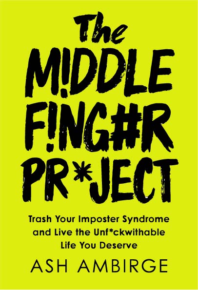
The first version of the cover included our signature neon purple, a hot pink, and a hot yellow. It reminded me of a 1980's Easter egg. Or that one shirt I wore during the same decade with all the laser beams all over it. Yes, LASER BEAMS—that's what this reminded me of. Neon Easter Egg laser beams.
And yet, upon gathering some outside opinions, other people didn't seem to mind. They thought it was cool. Sure, a few tweaks, but, didn't I like it overall?
No. The answer was no: I did not like it overall.
What's interesting is that the publisher, upon reviewing the first round ideas, agreed: he thought the treatment for the title needed to better reflect the nature of the voice inside. He wanted to see something more gritty and real—not neat and tidy. I WAS THRILLED.
What happens next is that, over the course of the next few weeks, I would click on yet another subject line many other times. And little by little, we were getting closer, but something was still not landing. So what did I do? Like a motherfucking woman, I decided to teach myself Adobe Illustrator. And I decided I needed to adapt the concept to match my own vision. And off I went, spending hours learning about the “trace” function and figuring out how to turn a JPEG into an editable vector image. (Pro tip: do not try this at home.) I played with colors and I played with taglines and I even went so far as to play with the interior, once you first open the book. “This book is a bad influence,” I scrawled in big, obnoxious letters across the inside.
Then I prepared a pitch deck. I put all of my ideas into a document. And I explained the thought process behind each one. Some of the colors were colors we had explored for the original TMF brand, before settling on neon purple. Some were colors that felt really bold and modern and hip, like that poppy red you see on everyone's lips.
This was me being a lawyer. Representing myself, advocating for myself, making an argument for my own ideas. And this is what every creative must do—because too often, we let our own voice get drowned out by other people with a gavel.
The beauty of working with Portfolio at Penguin Random House is that they are PHENOMENAL at collaboration. They welcome it. They ask for it. They check with me for something as simple as the way the endorsements read on the back cover, to other things as exciting as “do you mind if we give this gigantic, really important news outlet an exclusive excerpt of chapter five?” (Um, YES PLEASE.)
Every idea I sent them, they weighed and considered. And every idea, we'd discuss. I was never made to feel like I was “just the author.” I was made to feel like a real partner in the production of this book. It has been such a wonderful experience. And it was through this collaboration that I also learned how to become a serial killer.
In my advocating for myself, what happened was an exchange of ideas that sparked even bigger ideas. Because that's how creativity is made: by taking an old concept and smashing it up against a new one. But as a result, now we had too many ideas. Too many things that could work—so which do you choose? You've got to learn how to murder. This is where Penguin's experience truly shined.
“We need to signal that this book is for disobedient women,” they advised. “We've got a millisecond to get someone's attention: but not just anyone's attention, a disobedient woman's attention. Or someone who identifies as a disobedient woman, and their attention. So, how do we do that? Let's filter our ideas through that lens. Which ones say, “This belongs in your world?”
This proved to be a very useful exercise: all that time, I had been thinking only about what would appeal to ME—and I am a total weirdo with total masculine idiosyncrasies that even I don't understand. I hate small dogs. Barbie is a priss. I've never dreamed about weddings. I'll drink a beer with you any day of the week. And I know a lot of my readers are the same! We are awesome! We are fun! We are hilarious!
But, split-second impressions matter. And when it comes to a book cover, you don't have time to explain all of that to someone. You've got milliseconds to visually place yourself into a category. And that was the challenge: the visual piece. And also where I am sorely lacking. (Hello, words girl!) But also? I've spent my entire life removing myself from categories, that this was a new concept for me. Where do I fit on the shelf? What's my category?
So as I went through our collective ideas, I looked at it from a new perspective: instead of trying to stand out, like always, which covers signaled that this book belonged to women like us?
- The hot green chartreuse cover was the first to get the ax. That cover belonged to teenage skateboarding boys.
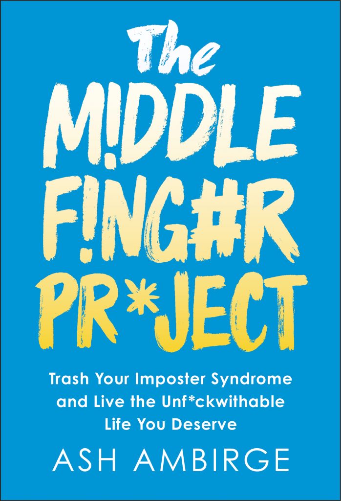
- Anything with blue and yellow got the ax. Those covers belong to therapists and the land of traditional self-help.
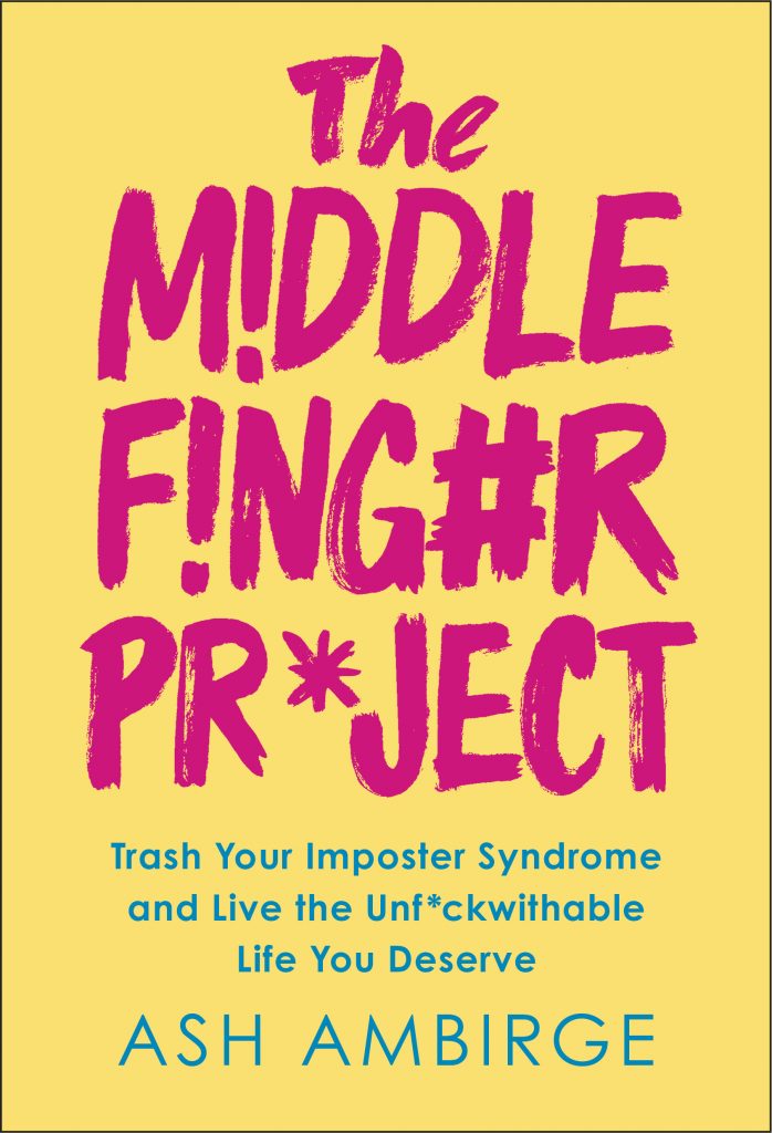
- Anything in pastels got the ax. Those covers belong to, um…nice people.
- Anything with red and black got the ax. Those covers belonged to mystery and crime novels.
- And believe it or not? In the end, we both ended up veto-ing our signature neon purple. It felt like it spoke to nobody. And if your customer is invisible, so is your product.
WELL. In the end we were left with a few choices. And in the end, the choice we made is the one I least ever expected in my entire life to make. It is a choice that reflects both the lawyer in me, who advocated for something more risky, and the serial killer in me, who knew that she had to kill what didn't belong in the world we wanted it to live in.
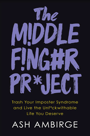
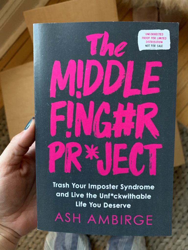
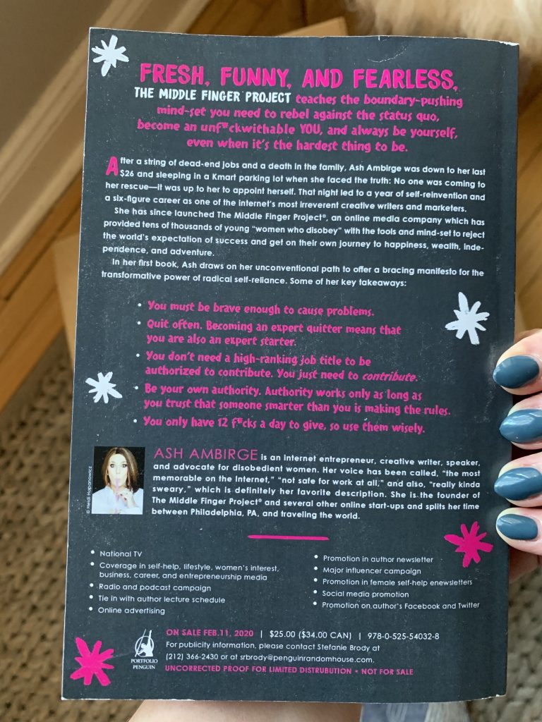
And so, it is today with incredible pleasure and honor that I present you with the mock up of our brand new book baby: IN ALL HER MAGENTA GLORY.
.
.
.
.
.
.
.
.
.
.
.
.
.
.
.
!!!!!!!!!!!!!
It's worth noting this is what's called a galley copy, so it's printed cheaply in paperback and without all of the bells and whistles of what the real book will look like, which will be hard cover, have a matte charcoal background and shiny magenta letters, without the description you see here. (The back will have endorsements and the description will be in the inside flap, as all hard cover books.) In fact, even the pink on the galley isn't entirely accurate—it'll lean much more hot magenta once printed in real life, too.
I really did tear up when I opened the box. I know that's cliché, but it totally happened. But this is not just my project: this is 10,000% fucking percent ours. You've been here reading for YEARS AND YEARS AND YEARS. We've shared ideas and we've shared memories and we've shared perspectives and we've shared good times and bad, just like any group of friends. You are a part of this book as much as I am, which is why when I announce our big pre-order launch next week for Thanksgiving, I'm going to do something special for you, too. We should all have a chance to bask in this fun, creative, rewarding, hella crazy victory!
So look out for THE BIG ANNOUNCEMENT, coming your way. I could say “watch this space” but my eyeballs might get stuck in their sockets backwards from the emphatic eye roll.
Thanks for being here, yo.
You're an honorary serial killer, too.
Love, Ash
P.S. For a laugh…
.
.
.
.
.
See what I mean? 🙂